The Importance of Responsive Design in 2025
In 2025, responsive design remains crucial for any business aiming to thrive in an increasingly digital world. As technology evolves, so do user expectations. Your audience demands seamless and consistent experiences across all devices—whether they're using a smartphone, tablet, laptop, or desktop. Responsive web design ensures that your website adapts to various screen sizes and devices, providing an optimal viewing experience. This article will delve into the importance of responsive design in 2025 and how it can benefit your business.

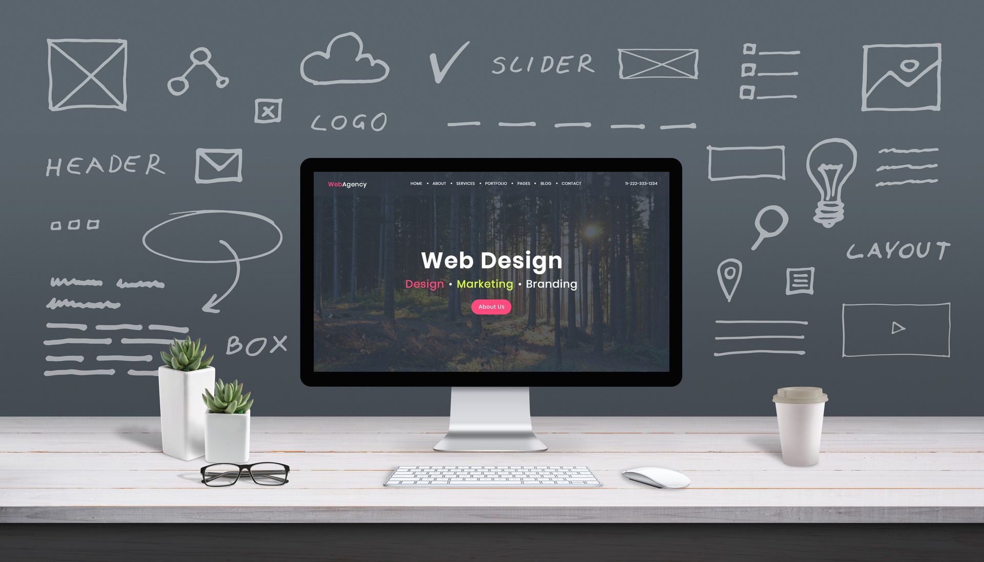
Photo By: Interaction Design Foundation
Understanding Responsive Web Design
Responsive web design is a method of designing web pages that automatically adjust to the size of the screen they're being viewed on. Instead of creating separate versions of a site for each device, responsive design uses flexible layouts, grids, and images to ensure a consistent user experience across all platforms. This approach is essential for modern web design, as it helps maintain a professional appearance and improves user satisfaction.
The Evolution of Web Design Terms
Web design has come a long way since the early days of the internet. As technology advanced, so did the terminology. In 2025, terms like "adaptive web design" and "mobile-optimized website" are common in discussions about creating the best website designs. Adaptive web design refers to creating different layouts for specific devices, while mobile optimization focuses on improving a website's performance on mobile devices. Both approaches play a role in modern web design, but responsive design remains the most versatile and effective strategy.
The Benefits of Responsive Web Design
Improved User Experience
A mobile web design that adapts to various devices provides a better user experience. When users can easily navigate your site, they're more likely to stay longer and engage with your content. A seamless experience across devices also reduces the likelihood of users leaving your site in frustration.
Increased Reach and Accessibility
Responsive design allows your website to be accessible to a wider audience. With more people using smartphones and tablets to browse the web, it's essential to ensure your site works well on all devices. A mobile-optimized website can help you reach potential customers who might otherwise be unable to access your content.
Better SEO Performance
Search engines like Google prioritize websites that are mobile-friendly. By implementing responsive web design, you improve your site's search engine ranking, making it easier for users to find you online. This increased visibility can lead to more traffic and potential customers.
Responsive Web Design Images and Visuals
Images play a significant role in creating an engaging web experience. In 2025, responsive web design images are more important than ever. It's essential to use high-quality visuals that load quickly and adjust to different screen sizes. This not only improves your site's performance but also enhances the overall user experience.
Choosing the Right Images
When selecting images for your website, consider the following tips:
- Use high-resolution images that look good on all devices.
- Optimize images for faster loading times.
- Ensure images are relevant and add value to your content.
Implementing Responsive Images
Responsive images adapt to different screen sizes, ensuring that they look great on any device. Techniques like using the
srcset attribute and
CSS media queries help you serve the best version of an image based on the user's device.

Photo By: W3 Schools
How to Check Your Website on Different Devices
Testing your website on various devices is crucial to ensure it looks and functions as intended. There are several ways to check your website's performance on different screens:
Use Browser Developer Tools
Most browsers come with built-in developer tools that allow you to test your site on various screen sizes. These tools enable you to see how your site looks on different devices without needing the physical devices themselves.
Online Testing Services
Numerous online services provide device emulation, allowing you to test your website on multiple devices. These services often simulate various screen sizes and resolutions, giving you a better understanding of your site's performance.
Physical Device Testing
If possible, test your website on actual devices to ensure a truly accurate representation of how users will experience your site. This method provides the most reliable results but may not always be feasible.
The Future of Responsive Web Design
As we move further into 2025 and beyond, responsive web design will continue to evolve. Emerging technologies, such as foldable devices and virtual reality, will present new challenges and opportunities for web designers. Staying ahead of these trends will ensure your website remains relevant and effective.
Embracing New Technologies
Web designers must adapt to new technologies to create the best website designs. Embracing advancements like AI-driven design and progressive web apps will help you stay ahead of the competition and provide users with cutting-edge experiences.
Prioritizing Accessibility and Inclusivity
As technology continues to advance, prioritizing accessibility and inclusivity will become even more critical. Ensuring your website is accessible to users with disabilities and provides a seamless experience for all will help you reach a broader audience and improve user satisfaction.
Conclusion
As we navigate through 2025, the significance of responsive web design cannot be overstated for businesses striving to excel in the ever-evolving digital landscape. At Quantifi Media, we understand that implementing adaptive web design principles, optimizing your site for mobile devices, and ensuring accessibility across various screens are essential steps for enhancing user experience and expanding your reach.
By prioritizing responsive web design, you not only cater to diverse customer needs but also significantly boost your SEO performance. Search engines reward sites that provide a seamless user experience across devices, which can lead to increased visibility and higher rankings in search results.
Ready to take your website to the next level?
Contact us today and learn how our expert web design services can create a modern, responsive website tailored to your business goals. Don’t let your website lag behind—embrace the future of web design and watch your online presence flourish!
Share this blog!